css技巧汇总
html
标签
- 设置页面的编码
viewport 核心点
- css中的px就可以看做是设备的独立像素
- 物理像素(在不同的设备之间,每1个CSS像素所代表的物理像素是可以变化的,下面得公式,根据dpr计算)
- devicePixelRatio(备物理像素和设备独立像素的比例,根据手机不同值不一样) = 物理像素 / 独立像素
三个viewport的理论
- layout viewport(网页的宽度) 通过 document.documentElement.clientWidth 来获取
- visual viewport(可视区域宽度) 通过 window.innerWidth 来获取
- 如果电脑宽度的网页放到首页上,肯定放不下,会出现滑动条 即(window.innerWidth < document.documentElement.clientWidth)
- ideal viewport(移动设备的理想宽度,即下面标签中的 width=device-width)
- ideal viewport并没有一个固定的尺寸,不同的设备拥有有不同的ideal viewport。所有的iphone的ideal viewport宽度都是320px,无论它的屏幕宽度是320还是640,也就是说,在iphone中,css中的320px就代表iphone屏幕的宽度
- ideal viewport 的意义在于,无论在何种分辨率的屏幕下,那些针对ideal viewport 而设计的网站,不需要用户手动缩放,也不需要出现横向滚动条,都可以完美的呈现给用户。
- 要得到ideal viewport就必须把默认的layout viewport的宽度设为移动设备的屏幕宽度。因为meta viewport中的width能控制layout viewport的宽度,所以我们只需要把width设为width-device这个特殊的值就行了。
// 下面这个就是设置  ideal viewport
 <meta name='viewport' content='width=device-width,initial-scale=1.0,maximun-scale=1.0,user-scalable=no'>
| 参数 | 解释 |
|---|---|
| width | 设置layout viewport 的宽度,为一个正整数,或字符串"width-device" |
| initial-scale | 设置页面的初始缩放值,为一个数字,可以带小数 |
| minimum-scale | 允许用户的最小缩放值,为一个数字,可以带小数 |
| maximum-scale | 允许用户的最大缩放值,为一个数字,可以带小数 |
| height | 设置layout viewport 的高度,这个属性对我们并不重要,很少使用 |
| user-scalable | 是否允许用户进行缩放,值为"no"或"yes", no 代表不允许,yes代表允许 |
- base标签 需放在包含url地址的语句前面 必须放到head标签中
 <base href="http://aaa/" target='_blank'>
 <a href="123">123</a>  => http://aaa/123
target
- _blank 在新窗口中打开被链接文档。
- _parent 默认。在相同的框架中打开被链接文档。
- _self 在父框架集中打开被链接文档。
- _top 在整个窗口中打开被链接文档。
table
 <section>
    <h1>表格</h1>
    <table border="1">
        <thead>
            <tr>
                <th>表头1</th>
                <th>表头2</th>
                <th>表头3</th>
            </tr>
        </thead>
        <tbody>
            <tr>
                <td>数据1</td>
                <td>数据2</td>
                <td>数据3</td>
            </tr>
            <tr>
              <!-- 占据两列 -->
                <td colspan="2">数据1</td>
                <td>数据3</td>
            </tr>
            <tr>
              <!-- 占据两行 -->
                <td rowspan="2">数据1</td>
                <td>数据2</td>
                <td>数据3</td>
            </tr>
            <tr>
                <td>数据2</td>
                <td>数据3</td>
            </tr>
        </tbody>
    </table>
</section>
- form
<section>
  <h1>表单</h1>
  <form method="GET" action="http://www.qq.com">
      <p>
          <select name="select1">
              <option value="1">一</option>
              <option value="2" selected>二</option>
          </select>
      </p>
      <p>
          <input type="text" name="text1" />
      </p>
      <p>
          <input type="password" name="password" />
      </p>
      <p>
        <!-- type="radio" 是单选框  多个单选框 name是一样 就代表他们是一组的 label的for与id进行关联  -->
          <input type="radio" name="radio1" id="radio1-1" />
          <label for="radio1-1">选项一</label>
          <input type="radio" name="radio1" id="radio1-2" />
          <label for="radio1-2">选项二</label>
      </p>
      <p>
          <button type="button">普通按钮</button>
          <!-- 出现在form中才有意义 -->
          <button type="submit">提交按钮一</button>
          <input type="submit" value="提交按钮二"/>
          <button type="reset">重置按钮</button>
      </p>
  </form>
</section>

  <!-- login 自行提交 -->
    <form onsubmit="login(event)" name='for'>
      账号: <input name='user' type="text">
      密码: <input name='password' type="text">
      <input type="submit"  value="登录">
    </form>
    <script>
      function login(e){
        console.log('123',document.for.user.value)
        e.preventDefault();
      }
    </script>
HTML版本
- XHTML(xml)
- 标签必须结束
- 属性必须带引号
- 标签属性必须小写
- Boolean属性必须写值
- html5(和4差不多)
- 标签允许不结束
- 属性不用带引号
- 标签属性可以大写
- Boolean属性可以不写值
- XHTML(xml)
元素分类
- 块级 block
- 常见的 div section article
- 行内 inline 在一行 不能设置宽高
- img text span
- inline-block 在一行 有自己宽高
- select元素
- 块级 block
HTML元素嵌套关系
- 块级元素可以包含行内元素
- p 不能包含块级
- 行内元素一般不能包含块级元素
- a 可以包含块级元素
- 块级元素可以包含行内元素
html考题
- doctype 意义
- 让浏览器以标准模式渲染
- 让浏览器知道元素的合法性
- 如果没有<!DOCTYPE>声明,那么不同的浏览器将会以自己不同的怪异的模式去解析渲染页面,称之为“怪异模式”
- HTML XHTML HTML5的
- HTML属于SGML
- XHTML属于XML 是比较严格的
- HTML5不属于前面2者 比XML宽松
- html5变化
- 新的语义化元素
- 表单增强
- 新的api 离线,音频,图片,本地存储等
- em和i有什么区别
- em是语义化的标签,表强调
- i是纯样式的标签,表斜体
- HTML5中i不推荐用
- 语言化意义是什么
- 开发者容易理解
- 机器容易理解结构(搜索,读屏软件)
- 有助于seo
- 哪些元素可以子闭合 (单标签,可以不加反斜杠)
- imput img br hr meta link
- HTML和DOM的关系
- HTML是'死'的
- DOM由HTML解析而来,是'活'的
- JS可以维护DOM
- property和attribute的区别
- attribute是'死'的 写在html中的
- property是'活'的 dom中的属性
- form的作用有哪些
- 直接表单提交
- 使用submit/reset按钮
- 第三方库可以整体提取值
- 第三方可以进行表单验证
css选择器执行顺序
- 浏览器是从右往左,加快解析速度
.body div .hello{
  color:red
}
/*
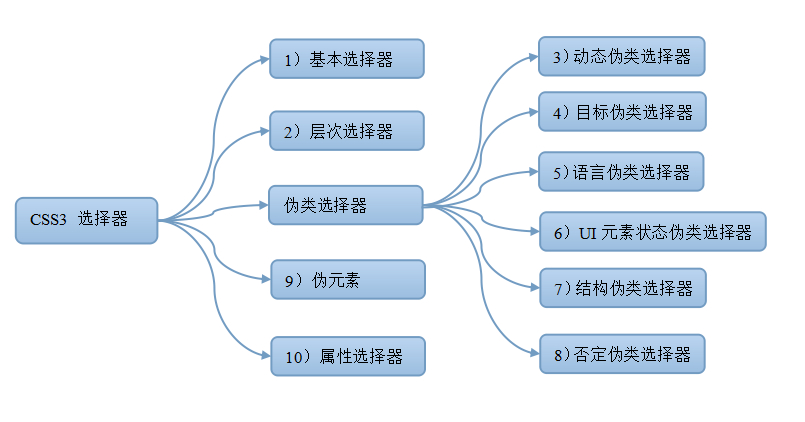
1、基本选择器
通配选择器 *
元素选择器 p
ID选择器 #id
类选择器 .class
群组选择器 p,span(作用于每个元素)
2、层次选择器
上下级(不同层次)
后代选择器(包含选择器) E F (E包含F)
子选择器 E>F (F是E的子元素)
同级(同层次)
相邻兄弟选择器 E+F (E后面的第一个元素是F)
通用选择器 E~F (E后面的所有F元素)
3、属性选择器语法
以单词为整体
E[attribute] 用于选取带有指定属性的E元素。
E[attribute=value] 用于选取带有指定属性和值的E元素。只能有一个的情况
[attribute~=value] 用于选取属性值中包含指定词汇的元素。多个单词中的一个,整个单词
[attribute|=value] 用于选取带有以指定值开头的属性值的元素,该值必须是整个单词(a1-12)指a1
以字符串
a[src^="https"] 选择其 src 属性值以 "https" 开头的每个 <a> 元素
a[src$=".pdf"] 选择其 src 属性以 ".pdf" 结尾的所有 <a> 元素。
a[src*="abc"] 选择其 src 属性中包含 "abc" 子串的每个 <a> 元素。
4、伪元素(伪元素改变文档结构)
E:before/E::before
E:after/E::after
伪类选择器(5个伪类)
5、动态伪类
a:link 未访问
a:visited 已访问
a:hover 悬浮
a:active 被激活
(a标签顺序从上到下)
a:focus 获取焦点
6、状态伪类
E:checked 匹配选中的复选按钮或者单选按钮表单元素
E:enabled 匹配所有启用的表单元素 form表单中的非禁用
E:disabled 匹配所有禁用的表单元素 禁用元素
7、目标伪类
E:target E元素被相关URL指向,才选择E元素
例子:当点击a链接,链接跳转到h1的时候,h1的文字会显示为红色
#big-bam-boom1:target {
color: red;
}
<h1 id="big-bam-boom1">Kaplow!</h1>
<a href="#big-bam-boom1">Mission Control, we're a little parched up here.</a>
8、否定伪类
E:not(F) 匹配所有除元素F外的E元素(F一般是 多个类中的一个)
div:not(.div){
background: red;
margin: 10px;
}
<div class="div">div1</div>
<div class="div1">div2</div>
<div class="div2">div3</div>
9、结构伪类(一般都是选择父元素下的)
E:first-child 父元素的第一个子元素 是E 与E:nth-child(1)等同
E:last-child 父元素的最后一个子元素 是E 与E:nth-last-child(1)等同
E F:nth-child(n) 选择父元素E的第n个子元素F。其中n可以是整数(1,2,3)、关键字(even偶数,odd基数)
、可以是公式(2n+1),而且n值起始值为1,而不是0.(n不能用别的字母代替)
E F:nth-last-child(n) 用法同上 取反 (odd是偶数)
(上面是第n个元素是E,下面是第n个E类型的元素,一般带of就是找类型,带child就是找元素)
E:nth-of-type(n) 选择父元素内具有指定类型的第n个E元素
E:nth-last-of-type(n) 选择父元素内具有指定类型的倒数第n个E元素
E:first-of-type 选择父元素内具有指定类型的第一个E元素,与E:nth-of-type(1)等同
E:last-of-type 选择父元素内具有指定类型的最后一个E元素,与E:nth-last-of-type(1)等同
:root 根元素
E:empty 选择没有子元素的元素,而且该元素也不包含任何文本节点
E:first-letter 选择 <p> 元素的首字母
E:first-line 选择 <p> 元素的首行(只要是折行都不算首行,可缩小浏览器试试)
E:only-child 选择父元素只包含一个子元素,且该子元素匹配E元素
E:only-of-type 选择父元素只包含一个同类型子元素,且该子元素匹配E元素
*/
选择器权重(+的值 是自己定义的 数值不会进位)
- 计算
- ID选择器 +100
- 类 属性 伪类 +10
- 元素 伪元素 +1
- 其他选择器 +0
- !important 优先级最高
- 超越!important max-width/min-width
- 元素属性 大于 style里面 大于 样式表
- 相同权重 后写生效
字体
- 字体族(不是具体哪一个字体)
- serif 衬线字体(特征带边边角角的,比如:宋体)
- sans-serif 非衬线字体(特征起和收都是很规则的,比如:黑体)
- monospace 等宽字体(编程一般都是 用这个)
- fantasy (花体)
- cursive (手写体)
- 设置 字体 字体族是不能加引号的 否则当字体处理
- font-family: "Microsoft Yahei", serif;
- 自定义字体(iconfont)
@font-face{
  font-family:'IF';
  src:url('./xxxx.ttf');
}
.custom-font{
  font-family:IF
}
行高
- line box(行高) 是由 最高的 inline box(内联元素)决定的
- line-height大于line box => line box 就会垂直居中
- 3个大小不同的字体 对其方式默认是基线对齐 若要居中 都要设置 vertical-align:middle
- 字体和图片并排 图片下面会有有空白
- 原因 图片就是一个内联元素 图片和字体 都是以基线对齐 基线和底线有距离 , 所以有空白
- 空白大小由字体小的决定,如果字体大小是12px 那么空隙就是3px
- 处理办法 给图片设置
- vertical-align:bottom 按底线对齐(默认是基线)
- display:block 块元素就不会由空隙
- 给父元素字体大小设置为0
背景(background)
color
pink 名字
#FFF 16进制
hls('色象','饱和度','亮度')
repeat
- repeat-x
- repeat-y
- no-repeat
position
- center center 正中间(也可以写像素)
size
- 100px 100px
origin
- padding-box 背景图像相对于内边距框来定位。
- border-box 相对于边框盒来定位。
- content-box 相对于内容框来定位。
雪碧图
- 将需要的图片合成一张图 每次引用 只显示需要的地方 减少http请求数
base64图片的格式 data:image/jpeg;base64,xxxxx; base64图片 体积变大 一般大1/3
background 通过origin 弄3个背景图 顺序border-box > padding-box > content-box (border->pading)
background:url('./1.jpg') no-repeat content-box,url('./2.jpg') no-repeat padding-box ,url('./1.jpg') no-repeat border-box;
边框
- 将一个9等分的格式 用来做边框
- border:30px solid transparent;
- border-image:url(./border.png) 30 round; 30 代表切割图片的30px round 代表 对齐方式
- 三角形
- width: 0px;
- height: 200px;
- border-bottom:30px solid red;
- border-left:30px solid transparent;
- border-right:30px solid transparent;
- 原理 左右透明 宽度为0
- border-radius 设置边角
overflow 设置滚动
- visible 显示
- hidden 超出的隐藏
- scroll 超出的设置滚动
- auto 自动
文字折行
- overflow-wrap(word-wrap) 通用换行控制
- 是否保留单词
- break-word 打断单词
- word-break 针对多字节文字
- 中文句子也是单词
- break-all 打断所有的
- keep-all 所有的单词都保持 不折断 中文句子也不折断
- white-space 空白处是否断行
- nowrap 让文本不换行 所有的都在一行
- 文字 超出部分的处理
- 单行文本
- overflow: hidden;
- text-overflow:ellipsis;
- white-space: nowrap;
- 多行文本溢出
- display: -webkit-box;
- -webkit-box-orient: vertical;
- -webkit-line-clamp: 3; //限制行数
- overflow: hidden;
装饰属性
- 字体(粗体) font-weight
- bold 粗体 /100 - 900 之间(整百)
- 斜体 font-style:itatic
- 下划线 text-decoration
- 指针 cursor
css考题
- 1、css样式(选择器)的优先级
- 计算权重确定
- !important
- 内联样式
- 后写的优先级高
- 2、雪碧图的作用
- 减少HTTP请求数
- 有一些情况下可以减少图片大小
- 3、自定义字体的市场场景
- 宣传/品牌/banber等固定文案
- 字体图标
- 4、base64的使用
- 用于减少HTTP请求
- 使用小图片
- base64的体积约为原图4/3
- 5、伪类和伪元素的区别
- 伪类表状态
- 伪元素是真的有元素
- 前者但冒号,后者双冒号
- 如何美化checkbox
- label[for]和id
- 隐藏原生input
- :checked+label
float
- 对自身的影响
- 形成块(BFC)
- 位子尽量靠上/左
- 对兄弟的影响
- 上面贴非float元素
- 旁边贴float元素
- 不影响其他块级元素位子
- 影响其他块级元素内部文本
- 对附近元素的影响
- 从布局上'消失'
- 高度塌陷
- 解决 overflow:hidden/atuo(开启bfc)
- 加一个伪元素
.clear::after{
  content:'';
  clear:both;
  display:block;
  visibility:hidden;
  height:0
}
css效果
box-shadow
- box-shadow:inset 4px 5px 6px 10px rgba(0,0,0,0.2)
- 内阴影 x方向偏移 y方向偏移 模糊度 扩展区域 颜色
- 可以复制一个 box-shadow:100px 100px 0 12px green
- border-radius 设置圆角 box-shadow形状跟着 也是圆角
- box-shadow 多个设置 可以做很多图形
.container{
    background:red;
    width:10px;
    height:10px;
    margin: 10px;
    border-radius: 5px;
    box-shadow: 200px 200px 0 5px green,
        230px 200px 0 5px green,
        215px 215px 0 -3px red;
}
text-shadow
- text-shadow:1px 1px 0px #aaa;
- x轴偏移 y轴偏移 像素模糊 颜色
- 作用 立体感 印刷品质感
border-radius
- width和height一样情况下 值50%就圆形
background
- 动画 准备一张雪碧图
.i{
  background:url('./xx.png') no-repeat;
  background-size:20px 40px;
  transition:background-position 0.4s
}
.i{
  background-position: 0 -20px
}
- 尺寸问题
- background-size
- cover 保持长宽比 不变 覆盖整个画面
- background-position:center center 图片居中 超出的部分隐藏
- contain 保持长宽比 不变 图片完成的显示出来 多的地方就空白了
- cover 保持长宽比 不变 覆盖整个画面
- background-size
clip-path(裁剪)
- clip-path:
- insrt(100px 50px) 切割成一个 100X50矩形
- circle(50px at 100px 100px) 切割成一个 圆形
- polygon 多边形
- 动画
.container{
  width:400px;
  height:300px;
  backgroud:url(xxx.jpg);
  clip-path:circle(50px at 100px 100px);
  transition:clip-path 0.4s;
}
.container:hover{
  clip-path:circle(80px at 100px 100px);
}
3D变换
transform:(可以叠加,不能变换顺序)
- translateX(100px) 往又轴偏移100px
- translateY(100px) 往上轴偏移100px
- translateZ(100px) 往Z轴偏移100px
- rotate(25deg) 旋转25度
3d
- html布局
- container 外面的盒子(轮廓)
- perspective: 500px;(主要设置值)
- perspective的值代表 眼睛看的距离
- cube 里面的盒子
- transform-style: preserve-3d; //设置旋转方式为3d透视
- transform: translateZ(-100px); // 围着Z轴旋转100px
- transition:transform 4s; // 设置动画
- #cube:hover{
- transform: translateZ(-100px) rotateX(90deg) rotateY(90deg);
- }
- cube六个面 通过transform计算位子分别定在6个面
  <div class="container">
      <div id="cube">
          <div class="front">1</div>
          <div class="back">2</div>
          <div class="right">3</div>
          <div class="left">4</div>
          <div class="top">5</div>
          <div class="bottom">6</div>
      </div>
  </div>
  .container{
      margin:50px;
      padding: 10px;
      border: 1px solid red;
      width: 200px;
      height: 200px;
      position: relative;
      perspective: 500px;
      // perspective的值代表 眼睛看的距离
  }
  #cube{
      width:200px;
      height:200px;
      transform-style: preserve-3d;
      transform: translateZ(-100px);
      transition:transform 4s;
  }
  #cube div{
      width: 200px;
      height:200px;
      position: absolute;
      line-height: 200px;
      font-size:50px;
      text-align: center;
  }
  #cube:hover{
      transform: translateZ(-100px) rotateX(90deg) rotateY(90deg);
  }
  .front{
      transform: translateZ(100px);
      background:rgba(255,0,0,.3);
  }
  .back{
      transform: translateZ(-100px) rotateY(180deg);
      background:rgba(0,255,0,.3);
  }
  .left{
      transform: translateX(-100px) rotateY(-90deg);
      background:rgba(0,0,255,.3);
  }
  .right{
      transform: translateX(100px) rotateY(90deg);
      background:rgba(255,255,0,.3);
  }
  .top{
      transform: translateY(-100px) rotateX(-90deg);
      background:rgba(255,0,255,.3);
  }
  .bottom{
      transform: translateY(100px) rotateX(90deg);
      background:rgba(0,255,255,.3);
  }
css面试题
- 如果用div画 xxx
- box-shadow 无线投影
- ::before
- ::after
- 如果产生不占空间的边框
- box-shadow 不给模糊的值就好了
- outline
- 如何实现圆形元素
- border-redius:50%
- 如果实现ios图标的圆角
- clip-path:(svg)
- 如果实现背景居中显示/不重复
- background-postion
- background-repear
- background-size(cover/contain)
- 如何平移/放大一个元素
- transform:translateX(100px)
- transform:scale(2)
- 如何实现3D效果
- perspective:500px // 透视距离
- transform-style:preserve-3d // 保留3D效果
- transform:tanslate rotate....
动画
过度动画
- 要求元素状态有变化
- transition: width 1s(缩写)
- 动画属性 时间
- 也可以是多个transition: width 1s,background 2s
- transition: all 1s;//all 代表所有
  .container{
      width: 100px;
      height: 100px;
      background: red;
      transition: all 1s;
  }
  .container:hover{
      width: 800px;
      background:green;
  }
- transition-delay : 1s 延迟1s
- transition-timing-function (定义动画进度和时间的关系)
- linear 线性 时间个进度 同步 (还有很多百度)
- cubic-bezier(...) 贝塞尔曲线
关键帧动画
- 与元素变化无关
- 相对于多个补间动画
  .container{
      width: 100px;
      height: 100px;
      background: red;
      animation: run 1s linear;
      /* animation-direction: reverse; */
      /* animation-fill-mode: forwards; */
      animation-iteration-count: infinite;
      /* animation-play-state: paused; */
  }
  // 定义
  @keyframes run{
      0%{
          width: 100px;
      }
      50%{
          width: 800px;
      }
      100%{
          width: 100px;
      }
  }
  <div class="container">
  </div>
逐帧动画
使用于无法补间计算的动画
资源较大
使用steps()
豹子奔跑(图片放到img文件夹内了)
- 一张雪碧图 通过keyframes 挪动图片的位子
  .container{
      width: 100px;
      height: 100px;
      border: 1px solid red;
      background: url(./animal.png) no-repeat;
      animation: run 1s infinite;
      animation-timing-function: steps(1);
  }
  @keyframes run{
      0%{
          background-position: 0 0;
      }
      12.5%{
          background-position: -100px 0;
      }
      25%{
          background-position: -200px 0;
      }
      37.5%{
          background-position: -300px 0;
      }
      50%{
          background-position: 0 -100px;
      }
      62.5%{
          background-position: -100px -100px;
      }
      75%{
          background-position: -200px -100px;
      }
      87.5%{
          background-position: -300px -100px;
      }
      100%{
          background-position: 0 0;
      }
  }
  <div class="container">
  </div>
css动画面试
- css动画的实现方式
- transition
- keyframes(animation)
- 过度动画和关键帧动画的区别
- 过度动画要有状态变化
- 关键帧动画不需要状态
- 关键帧动画能控制更精细
- 如果实现逐帧动画
- 使用关键帧
- 去掉补间 (steps)
- css动画的性能
- 部分高危属性 box-shadow等
布局
- flex
/*
  容器
    flex-direction  row/column(row-reverse,column-reverse)
    flex-wrap       wrap/nowrap/wrap-reverse
    flex-flow       上面2个集合默认row nowrap
    justify-content flex-start/center/space-between/space-around
    align-items     flex-start/center/baseline/stretch
    aligin-content  flex-start/center/space-between/space-around

  项目(6个)
    常用 flex 1
    align-self 可以覆盖 align-items
        flex-start/center/baseline/stretch/auto(默认)
*/
- 三栏自适应布局
// grid
<style>
  .one{
    display: grid;
    width: 100%;
    grid-template-columns:300px auto 300px;
    grid-template-rows: 100px;
  }

</style>
<section class="one">
  <div class="left">左</div>
  <div class="center">中</div>
  <div class="right">右</div>
</section>

// table
<style>
  .one{
    display: table;
    width: 100%;
    height: 100px;
  }
  .one div{
    display: table-cell;
  }
  .left{
    width: 100px;
    background: green;
  }
  .center{

  }
  .right{
    width: 100px;
    background: red;
  }
</style>
<section class="one">
  <div class="left">左</div>
  <div class="center">中</div>
  <div class="right">右</div>
</section>

// absolute
<style> absolute
  .one div{
    position: absolute;
  }
  .left{
    width: 100px;
    background: green;
    left: 0
  }
  .center{
    left: 100px;
    right: 100px;
  }
  .right{
    width: 100px;
    background: red;
    right: 0
  }
</style>
<section class="one">
  <div class="left">左</div>
  <div class="center">中</div>
  <div class="right">右</div>
</section>

// float
<style>
  .right{
    float: right;
    width: 100px;
    background: red
  }
  .center{
    float: left;
  }
  .left{
    float: left;
    width: 100px;
    background: red
  }
</style>
<section class="one">
  <div class="right">右</div>
  <div class="left">左</div>
  <div class="center">中</div>
</section>

// flex
.one{
    display: flex;
  }
  .left,.right{
    width: 100px;
    background: red;
  }
  .center{
    background: green;
    flex: 1;
  }
  .one div{
    height: 100px
  }

  </style>
  <section class="one">
  <div class="left">左</div>
  <div class="center">中</div>
  <div class="right">右</div>
  </section>
css盒子模型
- 基本概念 标准模型+IE模型
- 标准模型:margin+border+padding+content
- IE模型:margin+border+padding+content
- 标准模型和IE模型区别
- 标准模型 宽/高 指的就是content (不包含border和padding)
- IE模型 宽/高 指的就是conten+border+padding
- 两者之间的切换
- box-sizing:content-box 标准
- box-sizing:border-box IE
- JS如何设置获取盒子模型对应的宽和高
- dom.style.width/height
- window.getComputedStyle(dom).width/height
- dom.getBoundingClientRect().width/height 场景 一般用来计算元素计算的位子
- BFC 块级格式化上下文(边距重叠解决方案)
- 原理
- 1、BFC整个元素的垂直方向的边距会发生重叠
- BFC元素内的子元素 不会重叠
- 2、BFC的区域不会与float元素的区域发生重叠
- 3、BFC在页面上是一个独立的容器,里面外面的元素不会互相影响
- 4、计算BFC高度的时候 float元素也会参与计算
- 1、BFC整个元素的垂直方向的边距会发生重叠
- 如何创建BFC
- 1、float值不为none
- 2、position值不是static和relative
- 3、dispay值inline-box或者table相关的值
- 4、overflow的值不是visible
- 原理
网页可视化过程
- 网页可视化就是根据描述或者定义构建数学模型,通过模型生成图像的过程
- 解析html以构建dom树->构建render树->布局render树(layout tree)->绘制render树
浏览器本质上 是方便一般互联网用户通过界面 解析和发送http协议的软件
加载一个资源的过程
- 浏览器根据DNS服务器得到域名IP地址
- 浏览器向这个IP机器发送请求
- 服务器收到处理并返回http请求
- 浏览器得到返回内容
浏览器渲染页面的过程
- 根据HTML结构生成DOM tree
- 根据css生成cssDOM(模型)
- 将HTMLDOM和CSSDOM正常成renderTree
- 根据renderTree开始渲染和展示
- 遇到 script 会执行并阻塞渲染
从输入url到页面加载完成发生了什么
- 浏览器查找当前URL是否存在缓存,并比较缓存是否过期。
- DNS解析URL对应的IP
- 浏览器向这个IP机器发送请求
- 服务器处理请求,浏览器接收HTTP响应
- 浏览器得到返回内容
- 根据HTML结构生成DOM tree
- 根据css生成cssDOM(模型)
- 将HTMLDOM和CSSDOM生成renderTree
- 根据renderTree开始渲染和展示
- 遇到 script 会执行并阻塞渲染
预解析
- https 中a标签默认是非预解析 下面强制打开预解析
<meta http-equiv='x-dns-prefect-control' content='on'/>
用户代理
- 查看用户代理 navigator.userAgent
- 用户代理的作用
- 1、判断浏览器类型,采用兼容方方案
- 2、判断是否为移动端
- 3、userAgent伪装成本很低不要过度依赖
- 内核
- 可以直接管理硬件,操作系统通过内核进行系统调用,来使用计算机的硬件
- 浏览器内核 初步理解 将页面的字符转变成可视化的图像的模块
- 网页内容的组成
// meta 元数据信息
// charset 声明文档使用的字符编码
// http-equiv 客户端行为,如渲染模式,缓存等
vue
- scoped css
- 原理 帮元素加上一个自定义的属性
- css modules
- 原理 将样式编译成随机字符串
less
- 用node写的
变量
@color: #999;
@bgColor: skyblue;//不要添加引号
@width: 50%;
#wrap {
    color: @color;
    width: @width;
  }
extend
.animation{
    transition: all .3s ease-out;
    .hide{
      transform:scale(0);
    }
}
#main{
    &:extend(.animation);
}
混合
  @background: {background:red;};
  #main{
      @background();
  }
  @Rules:{
      width: 200px;
      height: 200px;
      border: solid 1px red;
  };
  #con{
    @Rules();
  }
scss
变量
- SASS通过$符号去声明一个变量。
$font-stack: Helvetica, sans-serif;
$primary-color: #333;

body {
  font: 100% $font-stack;
  color: $primary-color;
}
!default
- 如果不加!default $color不能被修改 ,添加够引入scss文件可以修改他的值
- 注意:需要将自定义的值先于 @import,否则也不生效。
/* 用法 */
$color: red!default;
Mixin
/* layout.scss */
@charset "utf-8";

@mixin flex($direction:column,$inline:block){
    display: if(inline==block,flex,inline-flex);
    flex-direction: $direction;
    flex-wrap: wrap
}

@import "./layout.scss";
@mixin btn($size:14px,$color:#fff,$bgcolor:#f04752,$padding:5px,$radius:5px){
  color: $color;
  padding: $padding;
  background: $bgcolor;
  background-color: $bgcolor;
  border-radius: $radius;
  font-size: $size;
  text-align: center;
  line-height: 1;
  display: inline-block;
}

@mixin list($direction:column){
  @include flex($direction);
}

@mixin panel($bgcolor:#fff,$padding:0,$margin:20px 0,$height:112px,$txtPadding:0 32px,$color:#333,$fontSize:32px){
 background: $bgcolor;
 padding: $padding;
 margin: $margin;
 >h4{
   height: $height;
   line-height: $height;
   padding: $txtPadding;
   text-overflow: ellipsis;
   white-space: nowrap;
   overflow: hidden;
   text-align: center;
   color: $color;
   font-size: $fontSize;
 }
}
extends
%message-common {
  border: 1px solid #ccc;
  padding: 10px;
  color: #333;
}
.message {
  @extend %message-common;
}

.success {
  @extend %message-common;
  border-color: green;
}

.error {
  @extend %message-common;
  border-color: red;
}

.warning {
  @extend %message-common;
  border-color: yellow;
}
引用父级选择器"&"
a {
  font-weight: bold;
  text-decoration: none;
  &:hover { text-decoration: underline; }
  body.firefox & { font-weight: normal; }
}
/*===== CSS =====*/
a {
  font-weight: bold;
  text-decoration: none; }
  a:hover {
    text-decoration: underline; }
  body.firefox a {
    font-weight: normal; }
reset
html, body, div, span, applet, object, iframe,
h1, h2, h3, h4, h5, h6, p,
blockquote, pre, a, abbr, acronym, address, big,
cite, code, del, dfn, em, font, img,
ins, kbd, q, s, samp, small, strike,
strong, sub, sup, tt, var, dl, dt, dd, ol, ul, li,
fieldset, form, label, legend,
table, caption, tbody, tfoot, thead, tr, th, td,
center, u, b, i {
    margin: 0;
    padding: 0;
    border: 0;
    outline: 0;
    font-weight: normal;
    font-style: normal;
    font-size: 100%;
    font-family: inherit;
    vertical-align: baseline
}
body {
    line-height: 1;
    background: #f5f5f5;
}
:focus {
    outline: 0
}
ol, ul {
    list-style: none
}
table {
    border-collapse: collapse;
    border-spacing: 0
}
blockquote:before, blockquote:after, q:before, q:after {
    content: ""
}
blockquote, q {
    quotes: ""
}
input, textarea {
    margin: 0;
    padding: 0
}
hr {
    margin: 0;
    padding: 0;
    border: 0;
    color: #000;
    background-color: #000;
    height: 1px
}
css 外部引入的方式
- @import 和 link
- @import属于CSS范畴,只能加载CSS。link是XHTML标签,除了加载CSS外,还可以定义RSS等其他事务
- link引用CSS时,在页面载入时同时加载;@import需要页面网页完全载入以后加载。
图片预加载 onload跟complete 的区别
- onload表示加载好,没有加载好不会执行onloa事件
- complete,无论src是否有值,成功与否,只要获取到image,就可以执行
css技巧汇总
- hover时候加边边框效果 会出现原来内容移动情况 可以在原来的内容上在一个 透明的边框 占位子
- 如果用 box-sizing 没有用,因为width 不变 当border增加的时候 内容位子会变化
<body>
  <style>
      ul,li{
        list-style: none;
      }
      li{
        height: 20px;
        border-left: 2px solid transparent;
      }
      li:hover{
        border-left: 2px solid red;
      }
  </style>
  <ul>
    <li>1</li>
    <li>2</li>
    <li>3</li>
  </ul>
</body>
src&&href
- src 是source的缩写,是页面必不可少缺少的一部分,是引入 常用的有 img script iframe
- src 加载js的时候,会暂停浏览器渲染,知道js加载完成且执行完成 才开始渲染
- href 表示超文本(引用) 常用的有link,a
 freightTemplateRuleWeight: freightTemplateRuleWeightFn(),
 freightTemplateRuleWeightList: freightTemplateRuleWeightListFn(),
{
  "areaCodeList": [],
  "freightTemplateRulePrices": {
    "fixedFreight": 0,
    "freight": 0,
    "isDefault": 0,
    "isFixed": 0,
    "orderPrice": 0
  },
  "freightTemplateRulePricesList": [
    {
      "areaCodeList": [],
      "key":0
      freightDatas:{
        "fixedFreight": 0,
        "freight": 0,
        "isDefault": 0,
        "isFixed": 0,
        "orderPrice": 0
      }
    }
  ],
  "freightTemplateRuleWeight": {
    "firstFreight": 0,
    "firstWeight": 0,
    "followFreight": 0,
    "followWeight": 0,
    "isDefault": 0
  },
  "freightTemplateRuleWeightList": [
    {
      "areaCodeList": [],
      "key":0,
      freightDatas:{
        "firstFreight": 0,
        "firstWeight": 0,
        "followFreight": 0,
        "followWeight": 0,
        "isDefault": 0
      }
    }
  ],
  "isParcel": 0,
  "remark": "",
  "ruleType": 0,
  "status": 0,
  "supplierId": 0,
  "templateName": ""
}